Quorso
An intelligent management platform that turns complex retail data into prioritized daily action. I redesigned their website with a stronger visual system, improved information architecture, and clearer content flow.
Quorso is a leading retail performance platform that helps store teams and head offices turn data into clear, actionable priorities.
By connecting KPIs with frontline execution, Quorso enables retailers to improve sales, availability, and operational efficiency at scale, across hundreds of stores at once.
Quorso had recently been through a rebrand, and the website needed to carry that new identity through end to end. I led the redesign: clarifying a dense, complex product story and giving it a digital presence that matches both the fresh brand and the platform's maturity.
A dense site that undersold a mature product.
The existing website struggled with dense content, fragmented messaging, and limited visual consistency. Product benefits were difficult to grasp quickly.
Crucially, the site did not fully reflect Quorso's maturity as a trusted enterprise retail solution. The credibility the brand had earned wasn't coming through.
Clarity, hierarchy, and storytelling.
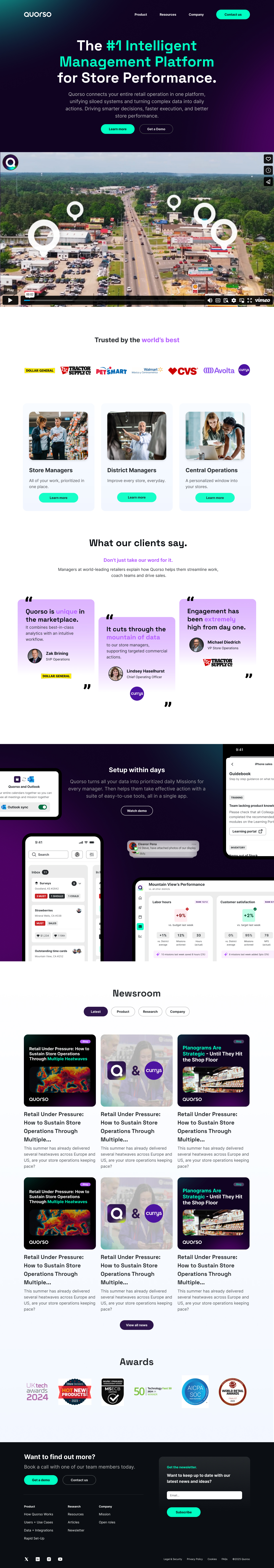
The goal was to clearly communicate Quorso's value proposition, simplify complex product messaging, and create a more confident, modern digital presence, making it easier to understand how the platform works and why it matters.
- 01Stronger visual systemA refined, confident design language that balances product clarity with the credibility of an enterprise brand.
- 02Improved information architectureRestructured navigation and content so users can find and understand what matters, faster.
- 03Clearer content flowModular layouts and refined typography guide users through complex information more intuitively.
- 04Responsive & scalableBuilt to perform across devices and to scale gracefully as the product continues to evolve.
I'm also working on the Quorso product itself, so I drew on their design system throughout to keep brand and product consistent, while treating this as a marketing site.
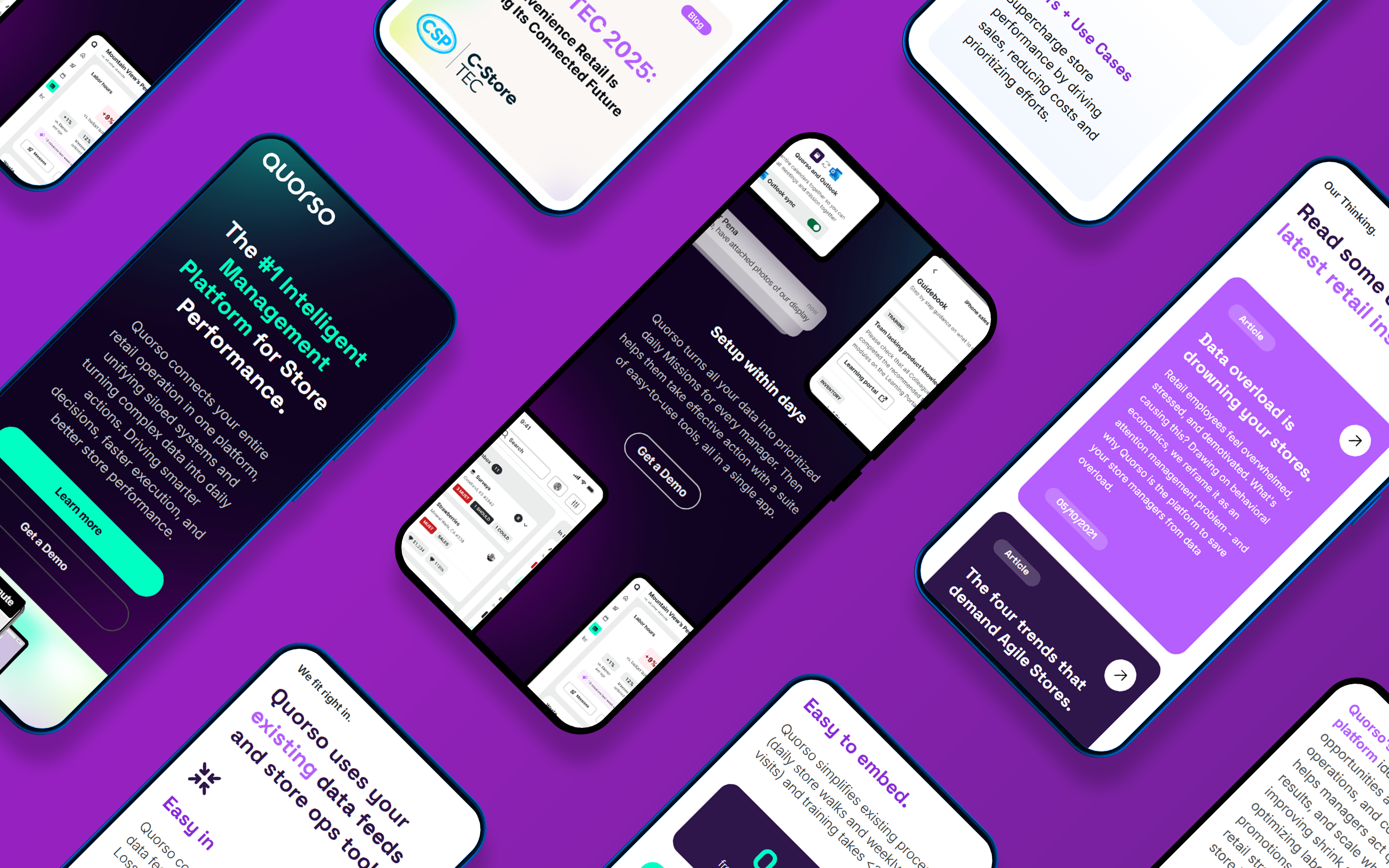
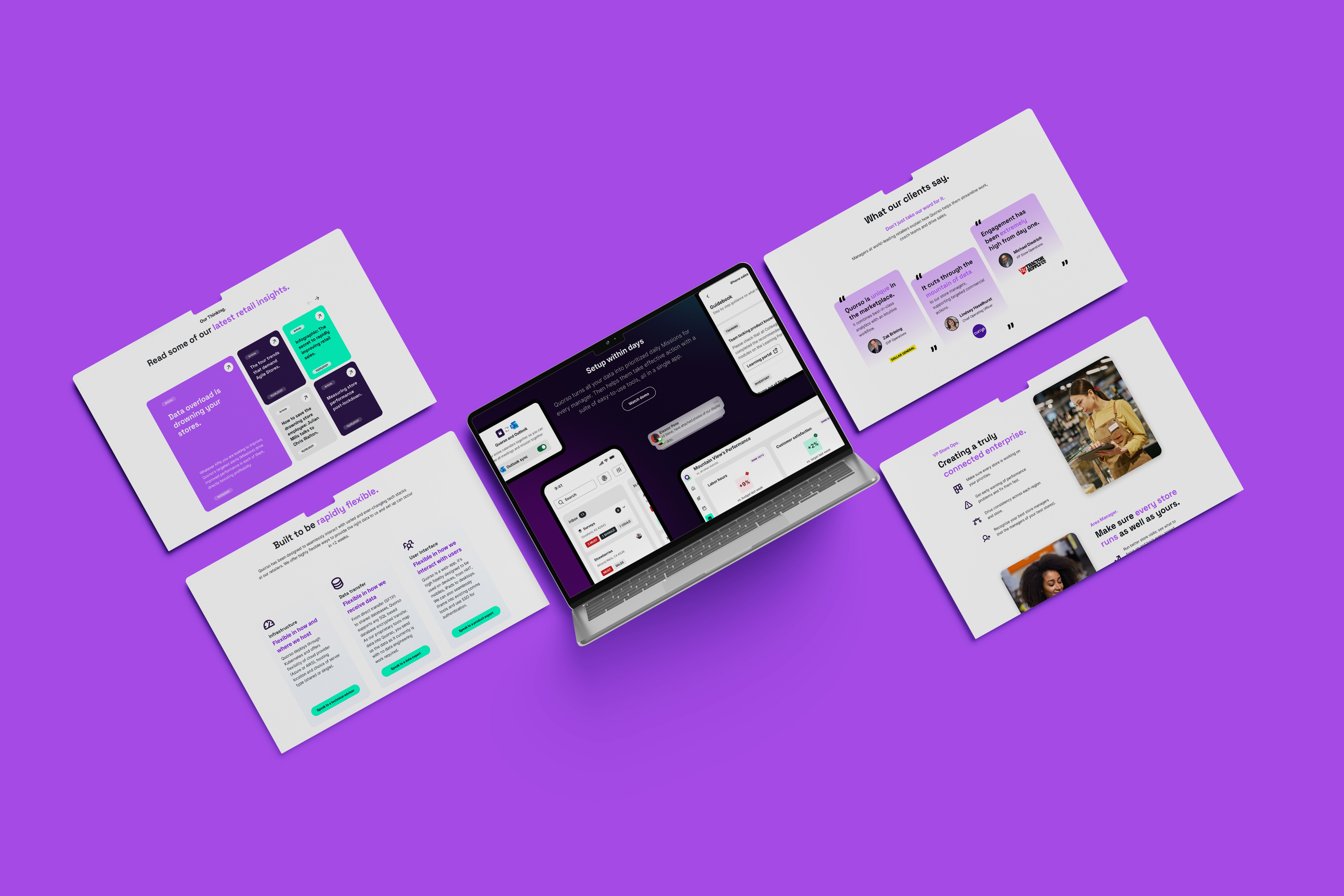
The full site, top to bottom.
From the homepage to the technical and use-case pages, each was rebuilt around modular layouts and a clearer content flow. Hover any screen to scroll through the full page.
 Hover to scroll
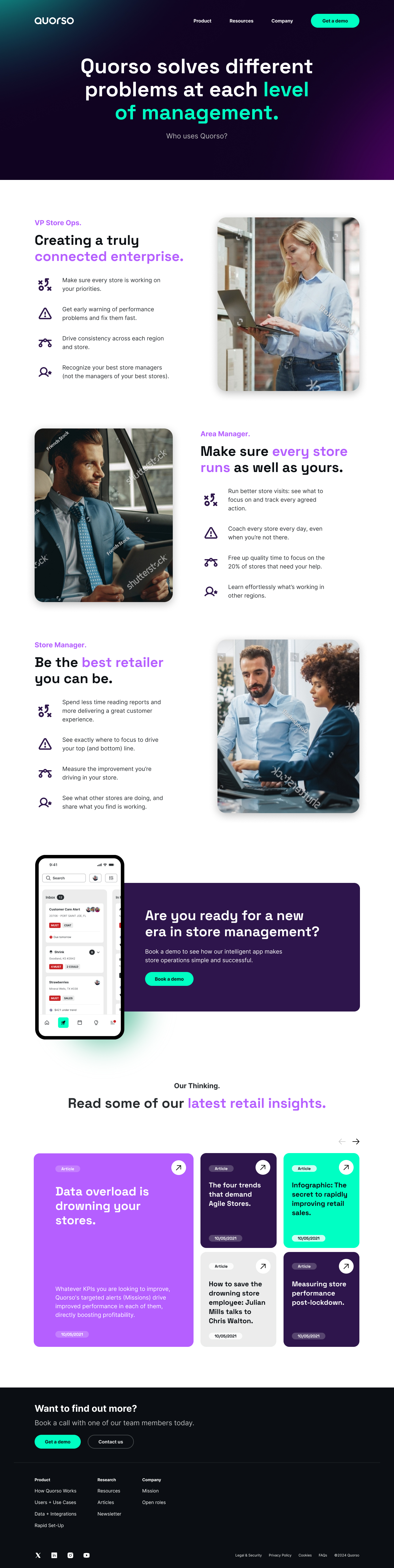 Hover to scroll
 Hover to scroll
 Hover to scroll
 Hover to scroll
 Hover to scroll
A clearer story, told with confidence.
The new design balances product clarity with brand credibility, making a complex platform easy to grasp and giving Quorso a digital presence that reflects how far the product has come.