Hell Energy
A sleek, modern website for one of the world's boldest energy drink brands. I led the design direction, building an engaging online presence that captures Hell Energy's spirit and attitude.
I had the opportunity to collaborate with Hell Energy, a prominent energy drink brand, on the design of their website.
The main goal was to build a visually captivating, engaging online presence tailored to their target audience. The final design aimed to offer a sleek, modern user experience while communicating the brand's energetic spirit.
A user-friendly site that's easy to navigate.
One of the key challenges was making sure the website was both user-friendly and easy to navigate.
To address this, we focused on a clear, intuitive layout that prominently showcased the company's products and essential brand information. I also implemented straightforward menus and links to make navigation seamless, so users could easily find what they needed.
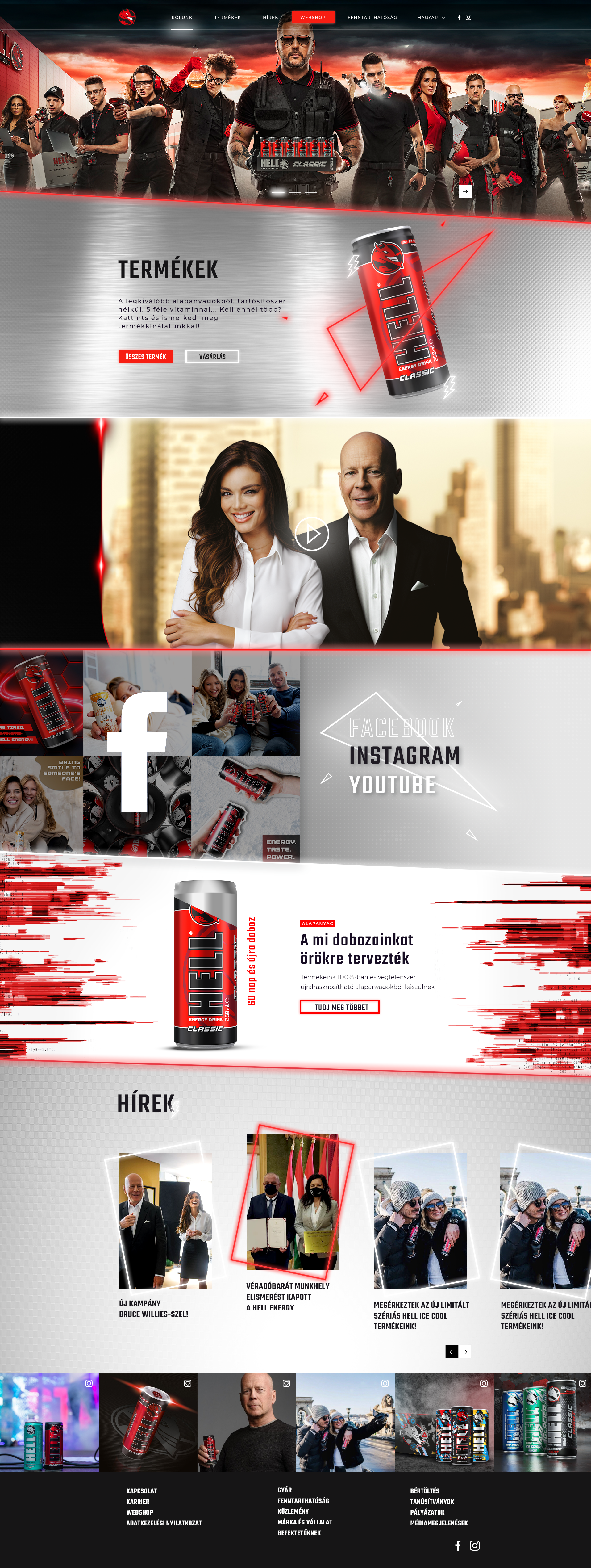
Where we started.
The previous site felt dated and was hard to navigate, with products and key brand information buried. It set the brief for the redesign. Hover any screen to scroll the full page.
 Hover to scroll
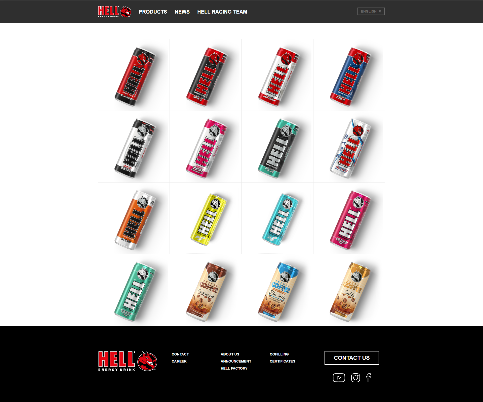 Hover to scroll
Leading the design direction.
As lead designer on this project, within a team at Dialogue Creatives, I worked alongside our marketing team and four other designers. I was responsible for guiding the overall design direction, covering layout, user interface and graphic elements.
- 01Design directionGuiding the look across layout, UI and graphic elements.
- 02Close collaborationWorking with the Hell Energy team to capture the brand's essence.
- 03Clear navigationSimple menus and links so users find what they need fast.
- 04Cohesive systemA consistent design that reflects the brand's identity.
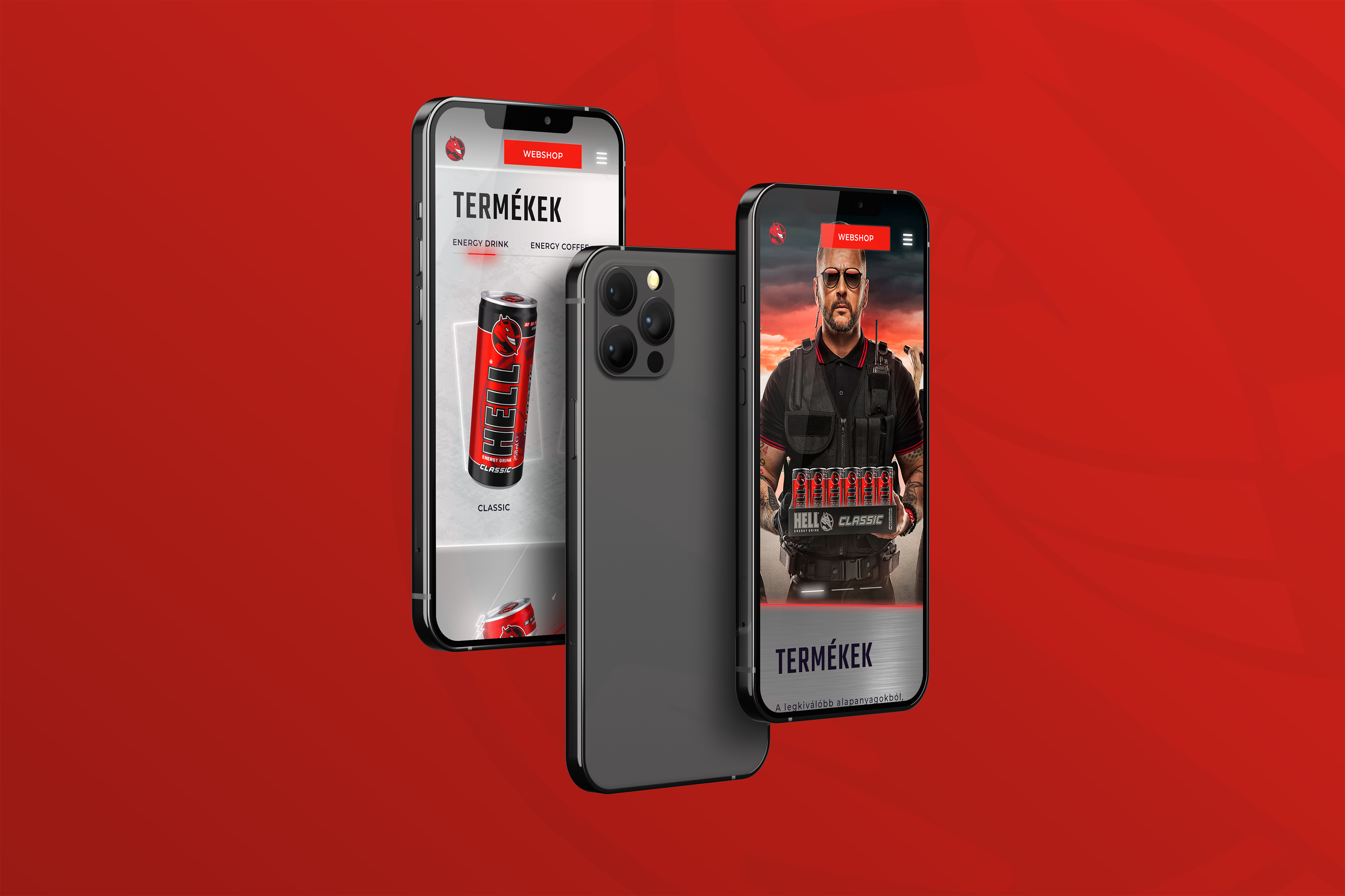
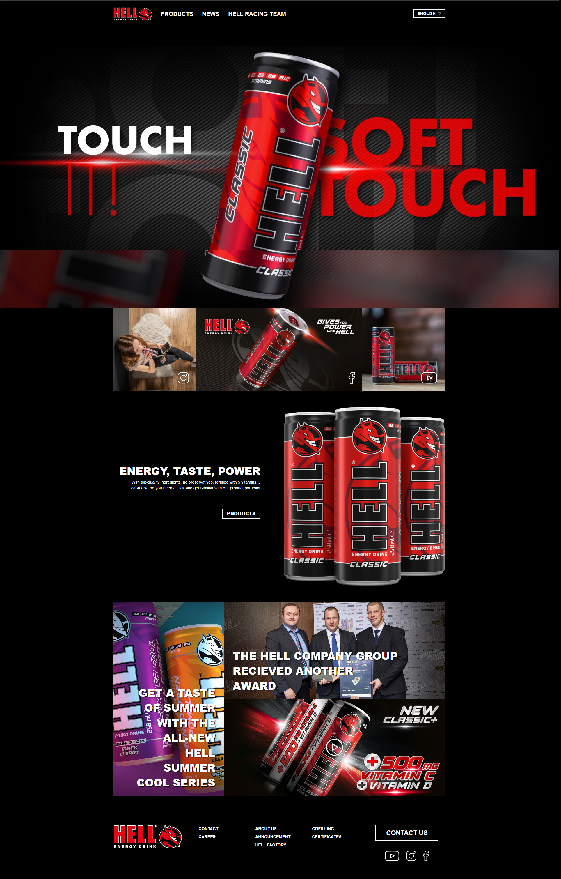
The redesign, top to bottom.
A bold, confident system that puts the products and brand front and centre, with clear navigation throughout. Hover any screen to scroll the full page.
 Hover to scroll
 Hover to scroll
 Hover to scroll
 Hover to scroll
 Hover to scroll
A site that captures the brand.
The result is a cohesive design that resonates with users and reflects Hell Energy's identity, capturing the essence of the brand and its messaging.